Sarah here and today I'm providing the details/close-ups of my creations with the beautiful ScrapThat! November Kit "Remember When . . ."
~~~~~~~~~~~~~~~~~~~~
Sisters
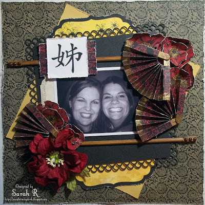
My first layout is based on the November Sketch (designed by Amarilys Doria). I created this layout for my sister - who has been trying to convince me for years that we should get matching tattoos of the Chinese characters for "Sisters". I'm not a fan of needles - so there is no tattoo (yet?!), but I thought this might make a nice gift for her since it is my favourite picture of the two of us.
All the items on the layout, are from the ScrapThat! Main Kit, with the exception of the chopsticks, craft sticks, embossing powder and white cardstock. I did lots of layering, distressing and fussy cutting for this layout. I also added in some Prima packaging as a photo mat - you can see it peeking out to the left of the photo. I used a Martha Stewart Edge punch for the black paper and fussy-cut the yellow 'bracket' shapes from the Bo Bunny Serenade "Trellis" paper.
I just loved the Bo Bunny Serenade papers - especially the "Garden" paper with the red poppies - perfect for fussy cutting! I cut out and layered the poppies and then highlighted the centres with Stickles in Yellow.
Given the Asian theme of the layout - I decided to create some mini-fan embellishments (check out the tutorial here!) - I just love how these turned out!
I also added a pair of Bamboo Chopsticks as embellishments. I inked these with the Prima Ink that came in the kit and added some Zva Pearls to the tops of the chopsticks.
~~~~~~~~~~~~~~~~~~~~
Autumn Leaves
This month, ScrapThat! teamed up with Sketchabilities and played along with the October 30th Challenge. I went with an Autumn theme for this layout and scrapped some adorable pictures of my son playing in the leaves in our yard in early October.
Lots of inking and distressing (including water distressing) on this layout - I wanted the paper edges to look like crinkled leaves.
Instead of just the three squares for the photos, I created tags using some of the cardstock that came with the kit and added ribbon (also in the kit) and twine bows (twine from my stash) to the tops of the tags. I also added a doily, which I cut in half and misted/inked (doily and mist from my stash, ink from the kit).
For the floral elements, I used the embellishment add-on and flower add-on from the kit - which included the gorgeous Prima beaded leaves and paper flowers, respectively. The large flower cluster (bottom right) includes a little window from the chipboard doors that came with the main kit - I simply inked it a few times to get the nice, dark finish that goes so well with the flowers.
I added the gorgeous pearl stick pin (main kit) to the flower cluster at the top of the tag on the right.
There are actually a few peek-a-boos on this layout - but this close-up really shows one of them well. You can also see one of the brown spirals that I created using the stems that I cut off the beaded leaves - I simply wrapped the wire stem around a narrow paintbrush handle to create these neat little accents.
~~~~~~~~~~~~~~~~~~~~
You Hold the Key to my Heart
I absolutely love the Prima Wood Doors that came with the Embellishment Add-On in the November Kit - but they kind of stumped me at first. So I decided to use them as - doors! - that open and reveal a picture of the cutest baby ever (not that I am biased at all). Playing on the "doors" theme, I called the layout "You Hold the Key to My Heart" (so true - my son is the love of my life!). Here are the two views of the layout (i.e. doors closed and doors open).
I used three different papers (though only bits of two) for this layout and embellishments from the Main Kit, Flower Add-on and Embellishment Add-on. The doors/bricks are the focal point of the layout (obviously) - but it took a lot of steps to get to what you see on the finished page, so bear with me if you want the full details!
Here are the steps I took to create the brickwork around the doors:
1. Trace the Prima Wooden Doors onto a piece of scrap paper and cut out the shape - this will form a "mask" so that you can leave a void for the placement of the doors inside the brickwork.
2. Decide where on your page you want the doors. You'll need to plan your page in advance - I chose to put my focus in the lower right since the Bo Bunny Serenade paper had such a pretty design in the upper left anyway. Attach the scrap-paper door shape to the layout with removable adhesive.
3. Choose your mask - I picked bricks to make it look like the doors were opening out of a brick wall - but any mask you like will work.
4. Place your mask and start filling it in with light molding paste (I used Golden brand). Don't be too perfect in this step - I did not want a perfect square of bricks and intentionally went with the offset, diagonal brickwork. Allow molding paste to dry.
5. Reset your mask and paint over the masked design - I chose black paint. It doesn't haven't to be perfectly painted - the next step will take care of any white that shows through. Allow paint to dry.
6. Reset your mask (again) and brush perfect pearls powder over the masked design - I used two colours, red and pewter. This will cover any white space left in painting and give the masked design a nice, multi-toned appearance (unfortunately, the full-effect of the perfect pearls doesn't come across in photos).
7. Remove the scrap paper door template and you now have a masked area with a void for the doors.
To attach the doors, I cut a piece of black cardstock to the same size/shape as the doors and used ribbon from the main kit to create "hinges" - gluing the ribbon to the back of the cardstock and back of the wooden doors. I then covered the back of the doors with some of the red/black patterned paper in the kit - not only does this look great, it hid the ribbon that I used to hinge the doors! Finally, I Photo-shopped my favourite baby picture of my son to include the title and printed it and trimmed it to fit behind the doors.
The last step for this layout was the embellishing! I used the tulle flowers from the Flower Add-on, keys and beaded leaves from the Embellishment Add-on and black tulle and white paper flowers from the Main Kit to create my floral clusters at the bottom left and top right corners of the doors. I also added in some fussy-cut dragonflies from another sheet of patterned paper.
That's it for my first month with the ScrapThat! Design Team. I hope you found a little inspiration from my layouts!


Such awesome pages, Sarah! Wonderfully done!
ReplyDeletebeautiful work!
ReplyDelete