Sarah here to share with you the details and close-ups of my layouts created with the ScrapThat! April Kit - "Within Nature".
~~~~~~~~~~~~~~~
Shattered
(Main Kit plus Mixed Media Supplies from Personal Stash)
First up is my Shattered layout. This layout is based on the March 15 Sketch at Another Freaking Scrappy Challenge and is sort of a companion piece to a layout entitled Through the Looking Glass that I created in January.(Main Kit plus Mixed Media Supplies from Personal Stash)
This is a pretty personal, revealing layout for me. I'm a very private person and don't often share my 'troubles' with others - but I've been dealing with some personal issues lately and sometimes it is cathartic to release some emotion through artwork. So this layout describes how I have been feeling - shattered - but I'm picking up the pieces and putting things back together - re-evaluating my priorities and what is important to me.
Enough about me - let's get down to the nitty gritty of the layout. I started out with one of the sheets of patterned paper in the Main Kit - the 'Soaring' page and used the lighter coloured side as the base page for the layout. I used the Prima 12 x12 Crackle stencil with some Heavy Gel Medium to get the crackled effect on the base page and then misted it with two shades of smooch spritz (Splash and River Mossy). Here is an angled shot of a section of the layout that better shows the crackle effect.
I did some stamping around the edge of the layout and where I was placing the title with a Kaisercraft Texture Stamp (Crackle) and black ink. I cut the torn 'notebook' paper edge using my Silhouette Cameo and tore the other paper strip for the paper embellishing in the top left of the layout.
I added a white smudged circle under the photo with gesso (you can just see the edges of the circle) and did some simple embellishing using the chipboard sign and roses that were included in the Main kit. I separated the chipboard sign and used the two elements to frame the photo. Once I had the chipboard and flowers in place, I did some more misting with Smooch Spritz in Black Velvet. I also added some Distress stickles in Clear Rock Candy to the chipboard elements after the misting had dried. Finally, I added some vinyl letter stickers from my stash for the title.
~~~~~~~~~~~~~~~
Sweet Puppy
(MK, FAO)
Next, is my layout entitled Sweet Puppy. My husband surprised me and my son with two (yes - TWO) Golden Retriever puppies just before Christmas this year. They are growing SO fast - and this photo is of the male puppy (Stark - and his sister is Pepper), who is going to be a giant! I had a lot of fun with this kit - playing with different designs and styles. For this layout, I wanted it to feel very soft and natural, so I started with the beautiful Twiggy paper, and layered that with the peach side of the Nancy's Mushrooms paper on top of the wood-grain Free paper.
I really like the soft, distressed look of paper tearing and love how the torn layers are cradling the fussy-cut picture of the sleeping puppy. For the title, I simply inked the awesome Alphabet Chipboard Stickers with some Distress Ink in Vintage Photo - I chose this colour because it coordinated so well with the wood-grain.
The gorgeous flowers on this layout are Petaloo Darjeeling - Burgundy flowers from the FAO. To finish off the flower cluster, I added in the leaves from the MK and some 'twigs', which are simply pieces of the edging off the burlap (included in the MK).
Finally, I created this double banner using the jute from the MK and the reverse sides of the leftover bits of paper from the torn pages of the layout. I decided to go with different banner shapes to create a more dramatic banner and raise the impact of the layered banner element. On the right side of the banner, you can see another of the gorgeous Petaloo flowers with a leaf and 'twigs'.
~~~~~~~~~~~~~~~
Good Old Boy
(MK, FAO, EAO)
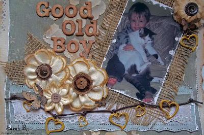
My final layout with the kit is based on Amy's gorgeous Sketch - be sure to check out the April Sketch Challenge on the ScrapThat! Ning site and play along for a chance to win a wonderful RAK. This layout features the cutest photo of my son and our 18-year old cat Teezer. I am continually amazed by the patience this cat shows for a toddler's over-zealous affection - hence the title Good Old Boy (though I debated using Poor Old Boy given what the poor cat puts up with....). I wanted to go with a rustic/vintage, distressed look for this layout - so I've done a lot of distressing and inking, including sanding the edges of the photo to make it look worn. I did some random punching with two different punches around the edge of the layout and used my fiskars paper tearer to create the wavy-edged green background page.
I did some masking with moulding paste and then spritzed it with Perfect Pearls mist in Heirloom Gold - I also did some inking on the masked area with Distress Ink in Vintage Photo. Not entirely happy with the masking, but it was an experiment. (They can't all turn out perfectly, right?) The layered strips of paper at the bottom of the layout were created with the same punches I used around the outside of the page. I also added in the Prima heart charm string embellishment from the EAO to finish off the layering here. I matted the photo on the burlap from the MK - which I frayed all around the edge to add to the rustic/vintage look of the layout.
I used the Prima flowers from the FAO, as well as some leftover flowers from the March Kit FAO to create the flower cluster. I cut the burlap leaves with my Tim Holtz Tattered Leaves die and fussy cut some butterflies from the Nancy's Mushroom paper to add to the flowers. I used the Chipboard Alphabet Stickers for the title and inked them with a generous amount of Distress Ink in Vintage Photo.
Finally, I added a small flower cluster with a butterfly and leftover charm to the top right of the photo. This flower originally had a more ornate centre, so I ripped that off and added the brown button so that it coordinated better with the other flowers. I also had to ink the edges of this flower and the smaller flower in the larger cluster (since they were all natural originally). Great detail shot of the photo and sanding here too!
~~~~~~~~~~~~~~~
Well, those are my creations with the ScrapThat! April kit - I actually have LOTS of paper and things leftover, so I'm sure that I'll be able to get at least another layout or two out of the kit and add-ons!
Thanks so much for stopping by the ScrapThat! blog today.


Such gorgeous pages, Sarah!! Thanks for sharing the close-ups and details!! ~ Blessings, Tracey
ReplyDelete