Happy Thursday, crafters! Sandi here today to share with you how I created this simple banner for my "Bobby" layout from the April kit.
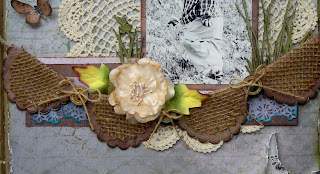
I started by simply cutting some scalloped ovals using my Spellbinders Classic Scalloped Ovals Large dies. For the burlap portion, I've used the next to the largest die and my Big Kick die cutter. I was not necessarily going for the scallops on these pieces since I knew they would ravel anyway. However, I wanted to stay consistent with the shape used in the next step.
After cutting 4 of the burlap ovals, I cut 4 larger pieces from the woodgrain card stock from the kit using the largest matching Spellbinders die.
Then I adhered my burlap pieces to my card stock using a spray adhesive. My original plan was to simply tack the pieces together and then put some Fraycheck on the burlap edges to keep them from fraying. I opted for this technique instead to reduce the fraying to a bare minimum.
Next I inked my edges heavily with some Quick Quotes Powder Puff Amaretto chalking ink. I also did a bit of doodling on the scallops to reinforce the curves lines.
After that was complete, I folded all my ovals in half.
Then I placed them in a single layer on the rope that came in the kit. If I had had more burlap to work with, I probably would have done multiple layers for a fuller, fluffier banner. However, I wanted to demonstrate what was reasonable with the amount of burlap that came in the kit, keeping in mind that I've used some of it on all 3 of my layouts.
Once my pieces were in place, I hot glued some buttons from a previous kit onto the rope and in between the folded ovals. These served as a nice base for attaching some jute bows and giving the banner some punch! The banner itself is actually hot glued to the page and the rope ends were snipped off beyond the page.
Once again, here is the completed banner and layout! I hope you'll give this a try soon! It was really quick and easy once I got started!
Thanks for coming by today!


What a brilliant technique to create this gorgeous banner!! Thanks for sharing! ~ Blessings, Tracey
ReplyDeleteThanks for sharing. I just love the effect. Perfect for a little boy layout.
ReplyDeleteLove the texture you gave to your banner!
ReplyDeleteWhat an awesome idea!! Thanks so much for sharing it!
ReplyDelete